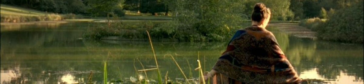

From closing frames of S&S (modeled on Andrew Wyeth picture?, Liew, Molinari, Sabino)

From closing frames of NA (imagery of pastoral intermixed with nightmare, novel as Catherine’s dream, Lee, Pildari, Eckelberry)
Dear friends and readers,
Surely it’s time to write about Austen here again. Long overdue some might say.
Last night I read and perused the latest graphic novel of Northanger Abbey, words chosen and written by Nancy Butler, the artist Janet K Lee; colorist Nick Pilardi, letterer Jeff Eckleberry. It’s a Marvel product and since in just the way the company that produces a film predetermines the shape and much that is indefinably the film so the comic book publisher Marvel predetermines elements of the commodity they sell. Thus it’s no surprise if the other Marvel graphic novel I own, which I also reread and looked at the pictures for far more carefully and deeply than I’ve done before, Sense and Sensibility, also by Nancy Butler, but this time artist Sonny Liew, colorist L. Molinai, Letterer Joe Sabino, showed a strong family resemblance.

The Dashwood family approaches Barton Cottage (Liew, L. Molinar, Joe Sabino, angle and shot from the 1996 Ang Lee/Emma Thompson S&S)

Catherine and Isabella exploring Bath (based on general gothic mode, Lee, Pilardi, Eckleberry) Isabella “easy, unreserved conversation” (!), showing Butler can do irony
Both have marvelous large pictures at the close of the most striking of the panels that are smaller inside the story — and here both are highly original or they allude to famous works of art or movie/movie genres.
I was surprised at how much I enjoyed them — I have a strong tendency to see these books as comic books but under the influence of Simon Grennan’s Dispossession, which I bought at the Trollope conference meeting, and is a graphic novel adaptation of Anthony Trollope’s John Caldigate, I began to look at the individual panels seriously for the first time, and could see they are genuinely art; in these two cases expressionistic, and project a general outlook and mood, not necessarily Austen’s but a reading of her. It’s obvious that Posy Simmonds and Audrey Niffennegger’s graphic novels are art, Simmonds’s images are so distinctive — and Niffennegger’s spun art in the manner of artistic poem books. These Marvel books are not so; they are deliberately set up in frames and use typologies resembling more comic book images — probably not to put off the comic book buyer. I can’t say that all Marvel comics are genuinely good; and I know some of the recent autobiographical graphic novels rich on text are poor on images (which makes them poor graphic novels), but these are worth perusal.
As with Posy and Niffennegger, one aspect of the enjoyment is the text. In both cases Butler is the writer and she choses wisely to take as much from Austen’s text straight as she can. I once had a publisher tell me when you publish about Austen let your guide by to quote her when you can. You are sure to please that way. So you are reading Austen epitomized, in bits and pieces, sometimes altered and expanded with piquant details, often from the era, but they are well chosen.

Mr Willoughby and Marianne have their first literary discussion: it’s about Scott

As Henry and Catherine drive up to the Abbey, it is gothic — purples, greys, angles which are edgy
The pictures matter of course, maybe more than the words. In the case of NA I was surprised to find very dark colors used for Bath itself, Bath made gothic, with overlarge oddly angled depictions of the characters (so we are inside their minds), haunting kinds of shapes for what happens. In the case of the S&S, there are zoom shots, the characters look so overawed and powerless against the screens they are caught in, especially Mrs Dashwood in her widow’s garb, at a kind of great distance angle of shot from on high, very sudden too.

The page where Catherine receives the invitation to go to the Abbey and discusses it with the Allens

Fanny Dashwood needling Mrs Dashwood to make her take Elinor away, Mrs Dashwood vowing not to take this punishment
Butler (in a preface) talks of Northanger Abbey as sending up the gothic, but the artist and especially the colorer made Bath into a gothic image, with the characters sometimes looming and scary in context. Everything feels pervasive from colors seeping around to lines — lots of odds oranges, off-color yellows, browns. As if a page is the inner or deeper feeling of Catherine. The lines on the face of John Thorpe make him menacing. Real grit in the S&S: this frame combines the melancholy of the three Brandons: Robert Swann who uses a cane (1983), melancholy Alan Rickman with that brown jacket (1996), David Morrisey brooding most of all:

(You do have to abandon your critical faculties to the cartoon’s edge into absurdity)
In the S&S panel you see the characters drawn as on a stage from different angles and then squares within squares with faces close up, so tensions from social life come out: in the preface to S&S Butler speaks of the book as about sisters, and outrage over the way the Dashwoods are treated by the laws and when they arrive in Devonshire custom. Butler and Lee’s S&S takes off from the movies.
It’s undeniable that many of the characters are drawn to recall specific actors in either the 1996 Emma Thompson S&S or the 2008 Andrew Davies one; the dresses; the way Colonel Brandon is figured as so strong, manly, and melancholy with a cane. Many of the frames prefer what happened in one or other other of these two S&S than Austen’s more simple lack of particulars. So Barton Park recalls the 2008 S&S grand mansion (even photographed or drawn in the same way) and Barton cottage the 1996 S&S house (as they come up the walk) though the inside is more like the 2008 (as they go through the place, with the same clothes as Charity Wakefield and Hattie Morahan had on). As this is the third time I’ve read this one I started to see new things, and for the first time recognized some memories of the 1983 S&S film too — in the dresses, in some of what’s emphasized in the choices of text, occasionally a frame resembles a shot in the 1983 film — the script writer for the 1983 film was Alexander Baron, a fine novelist in his own right who did quite a number of the Dickens and one notable Bronte adaptation for the BBC in the 1980s. Mrs Jenkins is even modelled on Patricia Routledge from the 1971 S&S (Denis Constanduros the writer), with this wild page showing Ciaran Maddan as Marianne and Joanna David as Elinor:

The hairstyle suggest Irene Richards is remembered in the grieving Elinor
Yet at the same time similarly there is a particular interpretation which is Butler and Liew’s own and it’s poignant because of the high shots. It’s more daylight mind (Molinari did the colors) here than the Marvel NA, with normal perspectives on the size of the characters (they don’t overwhelm a page) and the background made into light of the day or quiet of an evening so there is a quieter feel to the work.
I have read a previous graphic novel adaptation of Northanger Abbey (words Trina Robbins, illustrator Anne Timmons): a Gothic classics volume which contains 5 novels so each one is shorter (it includes Ann Radcliffe’s Mysteries of Udolpho, words Antonella Caputo, illustrator Carlo Vergara); I want to say that the pictures are in black-and-white makes them limited only I know that Posy Simmonds makes beauty, gives depth with drawings on white too. I think it’s the wild angles of the frames themselves, sudden thrusting and most of all that the gothic is kept to throughout.

Swirling

Also the use of Austen’s words: in the NA and S&S both occasionally Andrew Davies’s superb perceptive scripts.
I probably enjoyed them strongly because I’ve not been reading Austen in a while and when I return (I am grateful this is so) after having been away for a while, I forget all the outside materials I read about Austen: while some adds and enriches, so much is said or has been that to say something new or different (which is required) mars the experience because it’s so intermixed with the critic-writer’s political/social point of view and my feeling of how this book is supposed to operate for them in the Austen world, or just things that are said that are a new extreme and grate, or simply ignore the book altogether or mock it (in effect it’s so over-the-top in its reactive reading) though the person writing does not always know that.
Post-texts. S&S has the occasional wink as featured in the upper frame of its windowed cover:

while the NA is not above bats, and allusions to vampires, Udolpho and bookishness (the ancient table the two sit on are held up by fat ancient tomes)

I should not have been surprised as I love studying film (and films are moving pictures), loved art history and see pictures as endlessly meaningful when well done. In this Marvel NA, we have many narrowed eyes, on the male and female faces, suggestive; in this S&S really detailed developments out of Austen via different movies.

It’s a small vindication of the readings each perform since Austen’s words are used to pull NA into gothic realms, and easily host images from across 4 S&S films
My daughter Izzy bought the Northanger Abbey one on Sunday, November 1st, and we said it was appropriate to the season and All Saint’s Day — which for me would have been very lonely but for her and my two cats – and Austen and memories of the Austen movies.

Hattie Morahan as Elinor

Charity Wakefield as Marianne
Ellen
